
First Impressions: Why Your Open House Print Materials Still Matter
WHY PAY MORE?
First Impressions: Why Your Open House Print Materials Still Matter
Everyone went digital. Buyers still pick up the brochure. In a market where listings compete for attention on screens, the physical materials you put in someone's hands at an open house are doing a different kind of selling — and agents who understand that difference are winning listings because of it.
There's a narrative in real estate marketing that print is dead. Brochures are a waste. Flyers are old-fashioned. Everything that matters happens online now, and any dollar spent on print is a dollar that should have gone to Instagram ads or Zillow placements.
That narrative is wrong — or at least incomplete. And the agents who abandoned print entirely have quietly handed a competitive advantage to the ones who kept it.
Print didn't die. It just got more selective. The question was never whether to use print — it was whether to use it well. The reasons realtors still rely on brochures come down to something digital marketing has never been able to fully replicate: the experience of holding something in your hands and deciding it's worth keeping.
Why print didn't die — it just got more deliberate
Think about what happens at an open house. A buyer walks through the door. They've already seen the listing online — the photos, the price, the floor plan. They came because something caught their attention on a screen. But the moment they walk in, the experience shifts. They're no longer scrolling. They're present. They're touching countertops, looking out windows, standing in rooms and deciding how they feel.
In that moment, what you hand them matters in a way that a Zillow listing never can. A well-designed brochure in someone's hands says something about the seller's investment in the property and the agent's professionalism. It gives buyers something to take home, review with a partner, and return to after they've seen eight other listings that weekend. It keeps selling after the open house ends.
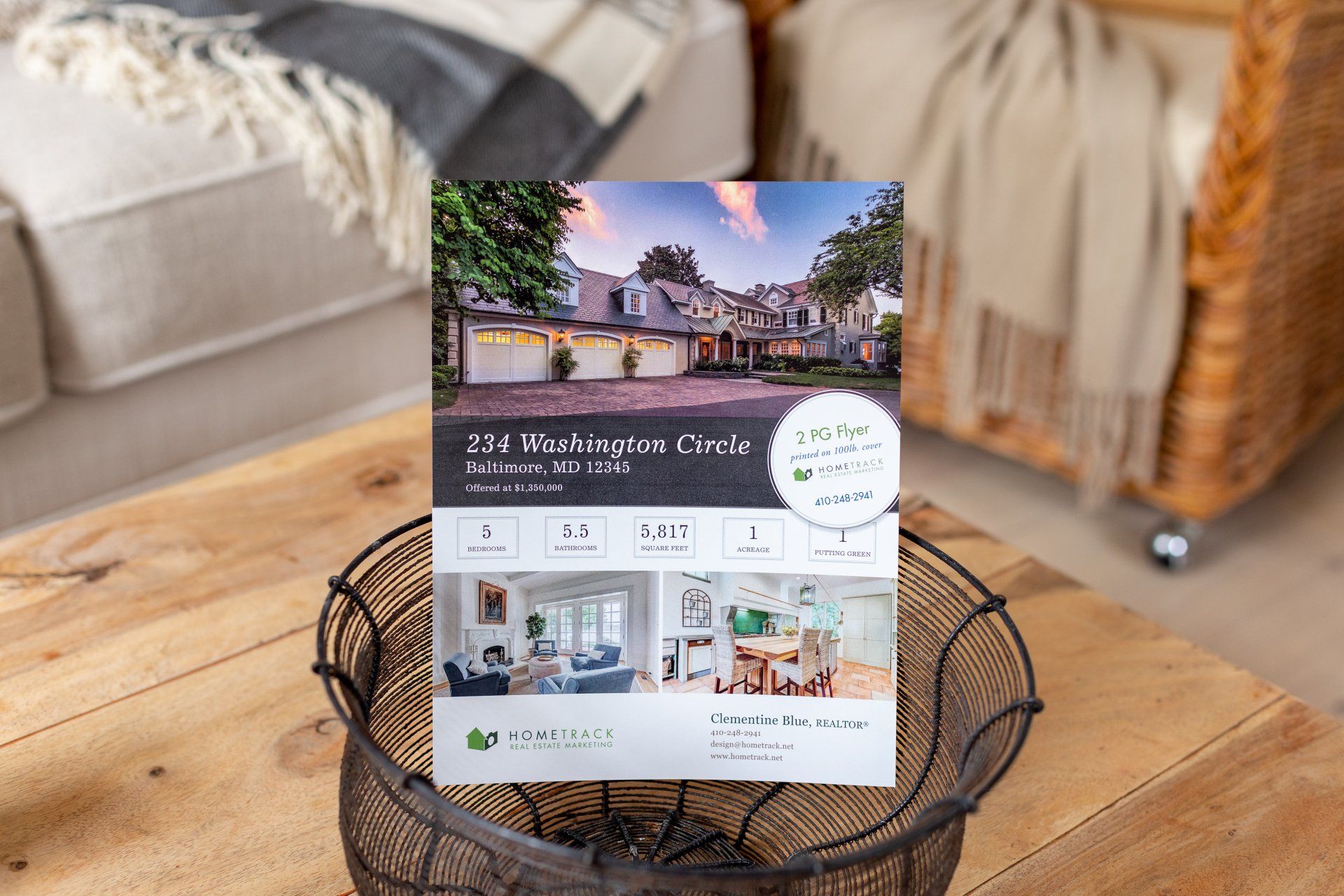
The open house brochure — what it actually needs to do

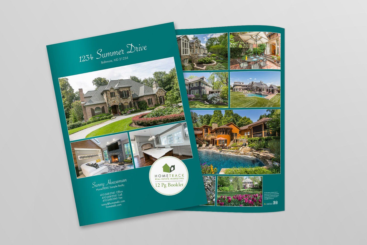
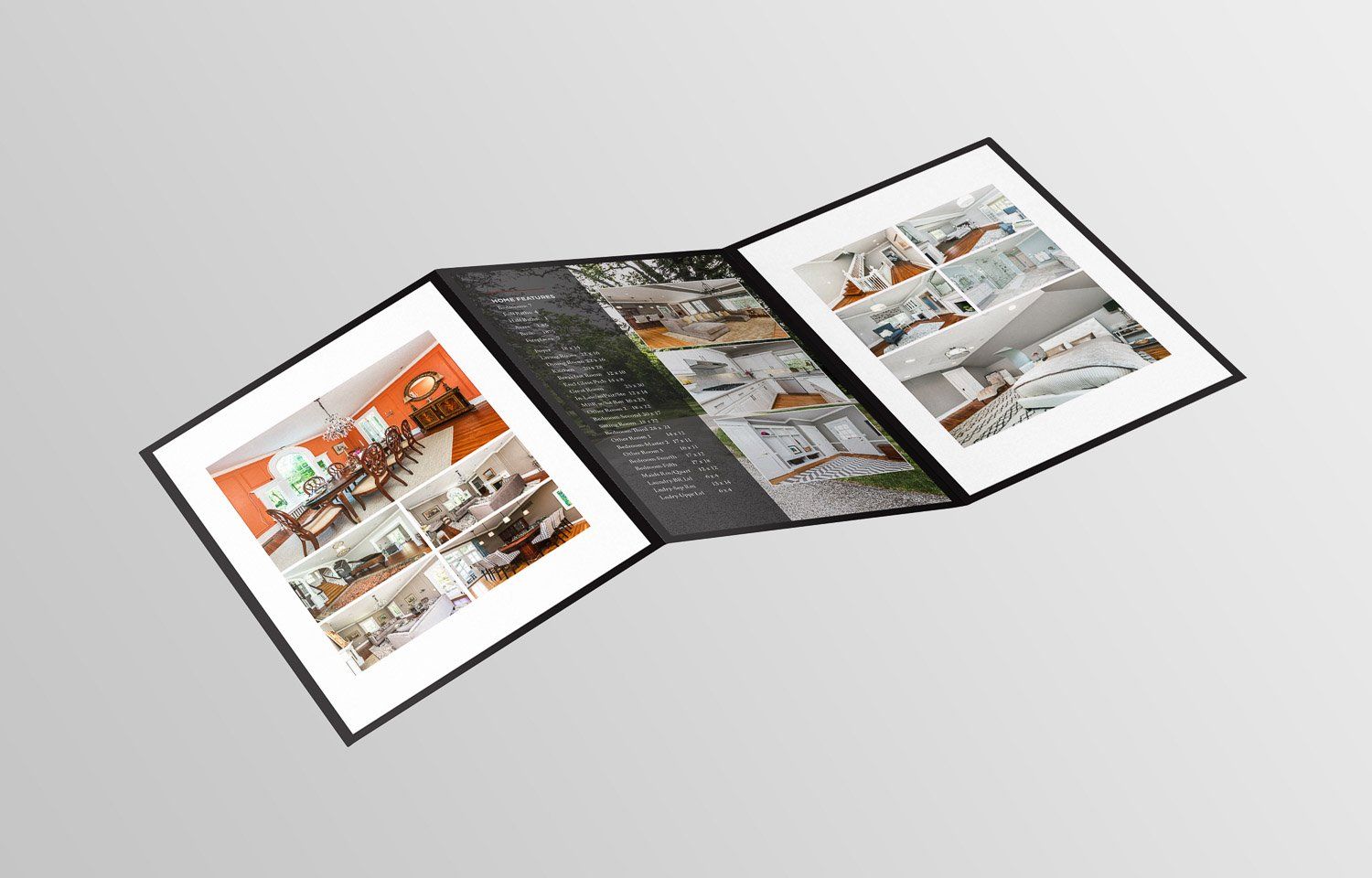
Most real estate brochures do too little with too much space. They list the facts — square footage, bedroom count, lot size — and call it a day. That's not a brochure. That's a spec sheet. And spec sheets don't make buyers fall in love with a property.
A great open house brochure does three things. It presents the property visually at its absolute best. It tells a story about how this home is lived in — the morning light in the kitchen, the backyard that was designed for entertaining, the neighborhood that makes the location worth the price. And it gives buyers enough information to remember this specific home after they've seen seven others that same afternoon.
Professional photography — full stop
The photos inside your brochure are doing the same job as the photos on the MLS — creating the visual impression that determines whether a buyer feels excited or indifferent. Low-resolution images, poorly lit rooms, or phone photos printed at brochure size look worse in print than they do on a screen. Preparing your listing photography appointment properly is what separates a brochure that gets kept from one that gets left on the counter.
Layout, hierarchy, and white space
A brochure that tries to include everything ends up communicating nothing. The essential elements of an effective real estate flyer apply equally to brochures: a clear visual hierarchy, enough white space for the design to breathe, and a layout that guides the reader's eye rather than overwhelming it. The property should feel curated, not catalogued.
Content that keeps selling after the open house
The best brochures include a brief neighborhood overview, a floor plan or room dimensions, and the agent's contact information presented as an invitation rather than a pitch. Real estate brochure design's most important rule is to prioritize the buyer's experience over the agent's self-promotion — and listings marketed that way consistently outperform the reverse. The buyer who takes the brochure home and shares it with a partner is the buyer who schedules a second showing.
The listing flyer — your street-level first impression

Before a buyer ever attends an open house, they've likely driven past the property. The yard sign catches their eye. If there's a flyer box, they stop and pull one out. That flyer is doing the same job as a listing photo on Zillow — creating a first impression in under three seconds that determines whether this property is worth a closer look.
Most listing flyers fail at this job because they lead with text. An address, a price, a bedroom count. None of that stops someone on a Sunday afternoon drive. What stops them is a photograph that makes the property look as good as it actually is — the exterior shot that captures the curb appeal, the kitchen detail that hints at the quality inside, the feature that makes this home different from the three others on the same street.
The flyer in the box is also the first thing a curious neighbor picks up — and neighbors are underrated as a referral source. Someone who lives two streets over knows people who want to live in their neighborhood. A well-designed flyer that impresses them is a flyer that gets shared. Effective open house print marketing treats every piece of collateral as a potential referral trigger, not just a buyer communication tool.
Postcards and neighborhood farming — print that builds authority over time
The most durable use of print in real estate isn't the open house brochure — it's the long game of neighborhood farming. Just listed and just sold postcards. Market update mailers. Seasonal touchpoints that keep an agent's name in front of a specific geographic area consistently over months and years.
The compounding effect of print farming is difficult to measure in the short term and impossible to ignore in the long term. An agent who mails the same neighborhood every six to eight weeks for two years becomes the local expert — not because they ran ads, but because they showed up physically in residents' mailboxes with relevant, professional content. Postcard marketing builds the kind of top-of-mind awareness that digital campaigns rarely achieve with the same consistency.
The just sold postcard is particularly powerful. It's social proof delivered to the people most likely to know someone who wants to sell. "This agent sold a home in your neighborhood" is the most compelling pitch a listing agent can make — and a well-designed postcard makes it at scale.
For agents looking to maximize reach while managing cost, EDDM and bulk mailing programs allow saturation coverage of entire carrier routes without a purchased list — making neighborhood farming accessible at almost any marketing budget.
QR codes — where print and digital become one system
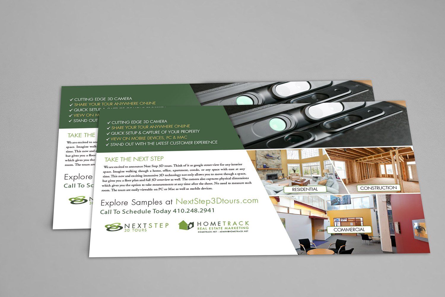
The single most important development in print marketing over the last five years isn't a design trend or a paper stock. It's the QR code — and most real estate agents are still using it wrong.
A QR code on a brochure or flyer isn't just a link to the listing. It's a bridge. The buyer picks up the brochure at the open house, scans the code, and is immediately inside the property's 3D virtual tour, watching the listing video, or navigating the interactive floor plan. The physical material becomes the entry point to the complete digital experience. Print and digital stop competing and start working together.
Used well, QR codes in real estate print marketing extend the buyer's engagement with the property long after they've left the open house. They make it easy for a buyer to share the full listing experience with someone who wasn't there. And they give the agent trackable data on how many people engaged with the print material — something that traditional print marketing never offered.
What to link — and what not to
Link to the property's dedicated landing page, 3D tour, or listing video — not to a general agent website or Zillow listing. The buyer who scans a QR code at an open house is already interested. Give them more of what made them interested, not a homepage that requires them to search for the property again. Every extra click between the scan and the content is a buyer you're losing.
What bad print materials actually cost you
There's a version of print marketing that's worse than no print marketing at all. It's the brochure that was clearly designed in Microsoft Word at eleven at night. The flyer with photos that look like they were taken on a phone in poor lighting. The postcard with four different fonts and a headshot that hasn't been updated since 2014.
Bad print materials don't just fail to impress — they actively create a negative impression. They signal to buyers and sellers alike that this agent either doesn't care about details or doesn't invest in their own professional presentation. And if they won't invest in the marketing of their own brand, why would a seller trust them with the marketing of a home?
- 01 Low-resolution photography. Photos that look fine on a phone screen print as blurry, pixelated, or washed-out. Every listing brochure and flyer should use professional HDR photography at full resolution. There is no substitute for this. A stunning property photographed poorly becomes a mediocre listing in print.
- 02 Crowded layouts with no hierarchy. When every element on the page competes for attention, nothing gets noticed. The eye needs somewhere to land first — the hero photo — and somewhere to go next. White space isn't wasted space. It's what makes the content that remains feel intentional and premium.
- 03 Generic templates that look like every other agent's materials. Buyers at an open house are often holding brochures from multiple properties. If yours looks identical to the others except for the address, it's not differentiating your listing or your brand. Design should communicate the character of the property, not just its specifications.
- 04 No call to action. A brochure without a clear next step — schedule a showing, scan the QR code, call for a private tour — is a conversation that ends on the counter. Every piece of print collateral should make it effortless for an interested buyer to take the obvious next action.
- 05 Inconsistent branding across materials. When the brochure, the flyer, the postcard, and the yard sign all look like they came from different agents, the overall presentation signals disorganization. Coordinating your direct mail and print collateral into a consistent visual identity makes every individual piece stronger.
Photography is the foundation of every print piece you produce
Every print marketing format discussed here — the open house brochure, the listing flyer, the just sold postcard, the neighborhood farming mailer — lives or dies on the quality of the photography inside it. Print amplifies photography in both directions. Great photos look extraordinary in a well-designed brochure. Poor photos look worse in print than they ever did on screen.
The investment in professional listing photography isn't just about the MLS listing or the Zillow page. It's about every downstream use of those images — the brochures that sit on open house counters, the postcards that land in neighbors' mailboxes, the flyers that catch someone's eye at the end of a driveway. Those images will be used in print at a scale and permanence that makes their quality matter in ways that a quick scroll on a phone never reveals.
The bottom line
Print didn't lose to digital. It evolved alongside it. The agents who treat print as a separate, old-fashioned channel are missing what it actually does — it creates a physical touchpoint in a buyer's decision-making process that no screen can replicate. It keeps selling after the open house ends. It builds local authority one mailbox at a time. And when it's connected to the digital experience through a QR code, it becomes the entry point to everything a buyer needs to make a decision.
The open house brochure someone takes home on a Saturday afternoon is still on the kitchen counter on Sunday night when they're talking about it with their partner. The listing on Zillow is buried under forty new ones. That's the difference print makes — and it's the difference that still matters.